
Cliphire
UX/UI Design Development
Job Finding App
Role: Research UX/UI
Tools: Figma & Figjam


Design process
Discovery
research
Debrief
Design
User Testing
Present
Discovery
OVERVIEW
In 2021, amid the challenges of the Covid pandemic, the design firm where I was employed closed down, leaving me jobless and uncertain about my next steps. I urgently needed to secure a new job. Unlike my previous experiences, where I landed jobs through connections, this was my first real job hunt. After submitting numerous applications and facing either rejections or no responses at all, I quickly realized that finding a job wasn't as straightforward as I had initially thought. In that timeframe, all I desired was an interview, a chance for them to gauge my personality and skillset. Without it, I felt like just another page in a stack.
While I regarded Linkedin as a useful tool, the ease of online applications seemed to contribute to oversaturation. Even today, when I ask people about their job hunts, a common sentiment is feeling overlooked in the online application process, with applications getting lost in a stack. I've concluded that networking, showcasing skills, and having a personality fit for the company play crucial roles in securing a job.
During a brainstorming session with a friend, as I sought to address significant issues, unemployment surfaced as a concern. I wanted to create a way for people to feel acknowledged in the job application process, avoiding the sense of wasting time. After scouring the internet and conducting research, it became evident that the ideal job application platform for our generation did not exist. This realization motivated me to take on the challenge and strive to fill that gap. In UX, I believe one of the crucial steps in finding the right solution is ensuring I identify the correct problem. Instead of making assumptions, I dive into thorough research.
bouncing off ideas
I had a chat with a creative and smart friend to share what I was working on. We talked about job hunting, and she shared her experience in finding her current job. We discussed the challenges she faced during the application process and brainstormed ways to make it better and faster. Then, we talked about the most popular apps today, like TikTok and Instagram, and explored why they are so popular. We came up with a theory that these apps make people feel heard and special. They showcase someone's personality and brand, and the likes and comments provide a sense of validation and visibility. That's when we made the connection: People often feel unnoticed through job applications and resumes, while apps like Instagram and TikTok make people feel seen and engaged in the experience.
"Making a hybrid app that mixes TikTok and LinkedIn could solve these problems"
- me after market research having a discussion with a friend about potential solution
Hypothesis
Research
MARKET RESEARCH
To validate my hypothesis and ensure it wasn't just a hunch, I needed to conduct thorough research. To start this process, it was crucial to familiarize myself with existing job sites and apps. Understanding what was missing in the current market and identifying what was already successful allowed me to generate solutions grounded in existing data.

Findings
-
Linkedin is oversaturated
-
None of these have a video aspect
-
Otta is user-friendly
-
LinkedIn is most popular for a reason
-
I plan to take in consideration of what parts of each I like and what I'd want to avoid
WHAT MAKES FINDING A JOB DIFFICULT?
Addressing this challenge demanded a more comprehensive perspective. To gain deeper insights into individuals' difficulties in securing new employment, I conducted interviews with five individuals from diverse backgrounds. Here are noteworthy quotes that showed their experiences:
"When your applying through those websites you aren't memorable. They don't know you so it's a bit impersonal"
" I don't even know my dream job."
“The job market is currently too crazy."
Following my user interviews, the imperative was to distill and synthesize the research findings, ensuring alignment with the right direction. To achieve this, I crafted an affinity map, providing a structured visualization to organize and decipher the core needs of the user.
AFFINITY MAPPING
I asked these people similar questions about their jobs past or present and how they got those jobs. I organized this data in Figma, you can view all of it if you click photo:


From the affinity map, I made some major key insights:
-
Reviews make people look more reliable and real
-
5/5 people think personality and demeanor plays a role in getting a job
-
Resume portrays someones experience, but not their personality, drive or skill
-
4/5 said it's easier to understand a personality through a movie rather than a book
-
Networking is a huge part of getting a job
User Persona
Derived from the insights gained through user interviews and the Affinity map, I crafted a persona representing a potential user who could find value in my app. Meet Teresa, a CEO actively seeking to make new hires.

Debrief


Create an application designed to assist individuals of all ages in discovering the most fitting job or employer. This app aims to provide a platform where individuals can be acknowledged and heard through video representation, as opposed to a traditional resume lost in a pile. Additionally, it facilitates the formation of friendships and professional connections.
PROPOSAL
-
Connect the user: A common pain point was feeling like landing a job was impossible without a connection, this app is made for connecting.
-
Make User feel seen: Another common pain point amongst people in interviews was feeling like applying with a resume was a waste of time because they got no response
-
Create a user friendly experience: When an app has too many things on it it can get overwhelming, this app is pretty straight forward and designed in a way that's visually pleasing and easy to navigate.
GOAL
PROJECT GOALS
After making a clear proposal and goal, I had to make sure my business goals, technical considerations and user goals aligned.
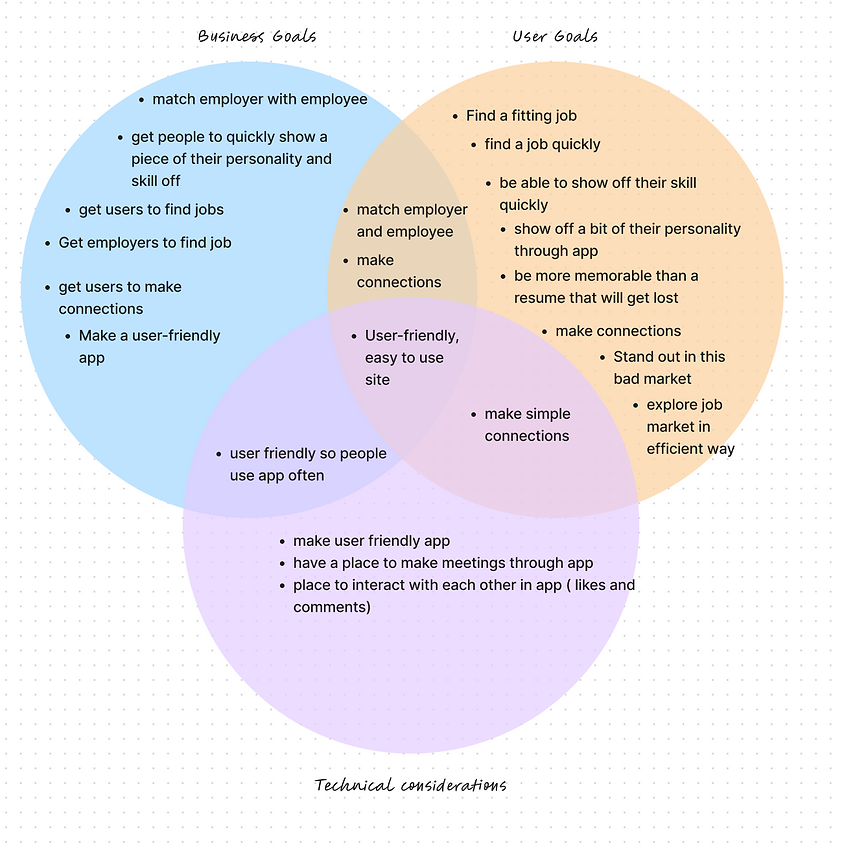
Following research and validation that affirmed the utility of my solution for a prevalent issue, the next step involved prioritizing crucial features. With project deadlines in mind, I couldn't dedicate unlimited time to developing every feature. A well-defined problem statement significantly facilitated the process of determining which features held the highest priority.
The current job market can be disheartening, with the process often feeling prolonged and discouraging. A significant frustration among users is that their resumes end up "lost in the stack" or overlooked on job recruiting sites. Many express feeling invisible and as if their time has been wasted in the process. However, when individuals secure an interview, there is a notable increase in confidence as it allows them to showcase not only their skills but also their personality and drive.
Feature set

SITEMAP
Users will be prompted to sign in upon accessing the app. Once signed in, the home page will provide options to view their own likes, access their profile, and check messages.

USER FLOW
Upon creating a sitemap, I delved into exploring potential user journeys within the app. I specifically focused on two pathways:
-
Login, Like a Photo, and Send a Message
-
Find Connections and Send a Calendar Invite
These paths were chosen strategically as they hold significant importance to the core functionality of the app. In the upcoming development phase, users will be encouraged to test these pathways. For a detailed visualization of the user flows, kindly click on the photo below to access the Figma file.


Design
BRANDING
I chose this color because it is vibrant, yet professional. I made the logo in illustrator.


Primary
Secondary


LOW-FI wireframes
This phase consumed a significant amount of time, marking the point where I intricately developed and organized my ideas to ensure a cohesive integration. These sketches served as the foundation, making subsequent steps considerably more manageable. Although the wireframes underwent evolution in each subsequent stage, I consider this initial phase pivotal, as it provided the starting point to kickstart the entire process.

Hi-FI wireframes
After Low Fi testing, which involved conducting five distinct user tests on:
-
Observing users as they vocalized their task completion and timing the process.
-
Identifying any deficiencies within the application.
-
Attentively listening to and considering all user suggestions.
I I transitioned to the development of Hi-Fi Wireframes. This phase, while meticulous, was straightforward. Consistency was paramount across all designs within the app, encompassing aspects such as colors, spacing, and more. The meticulousness involved multiple reviews to ensure the absence of minor errors. The primary challenge lay in establishing seamless connectivity between all wireframes, prioritizing a user-friendly experience.

User Testing
I tested my high fidelity Design on 6 people, with a range of backgrounds. I did this over zoom and recorded each session where I tested out three different tasks.
-
6/6 participants enjoyed the product and thought it was a good idea
-
6/6 finished all tasks in under a minute
-
Most participants made important points on how to improve, below I'll go into specifics on what things I changed after the interviews
ITERATIONS
After user testing :
Change 1:
During a group critique and an interview, a valid point was made that if a company was hiring, they may be looking for different positions. This way when looking for a potential hire, a company is able to stay organized and have subgroups for different positions.

Before :

After :
Change 2:
After the 5 interviews 3/5 people took longer than expected to find the connections in the profile section. After discussing and testing, I changed the connection underline to a button, so it is cohesive with the rest of the app and easier to find. I also added a drop-shadow under the edit icon to make it more obvious that it's a button.


Change 3:
After the 5 interviews 2/5 people took longer than expected to view a profile from a message. After discussing and testing, I decided that the users name could be in two places for more clarification


Change 4:
In a group critique, there was something so obvious that I felt embarrassed to miss. A few people pointed out that there was no where to search! So of course I added that to the home page, which meant I had to move some things around. The new and improved logo was also added


Present
Final prototype
After this entire process, you can click on the blue button to view my prototype : )
conclusion


In summary, the development of Cliphire, merging TikTok's dynamism with LinkedIn's professionalism, has been an enriching venture in UX/UI design. Post Hi-Fi testing, subtle yet crucial changes were made, reinforcing the importance of continuous user testing and iteration.
These adjustments, born out of the need to address overlooked details, exemplified the significance of maintaining a vigilant eye on user experience. From the absence of a home page search feature to the inconspicuous appearance of the connections button, each refinement was a response to user insights, ensuring Cliphire aligns seamlessly with user expectations.
This experience emphasized the value of an iterative design process, especially under time constraints. Rapid iterations not only pinpoint flaws but also expedite the ideation and implementation of effective solutions, a crucial aspect in today's dynamic design landscape.
Cliphire could takes strides in reshaping the landscape of social and professional networking, I am proud of my achievements and excited about the continual process of refinement. The design narrative persists, and I look forward to exploring further possibilities and crafting delightful experiences. For inquiries, feedback, or potential collaborations, I am eager to connect and continue pushing the boundaries of design.